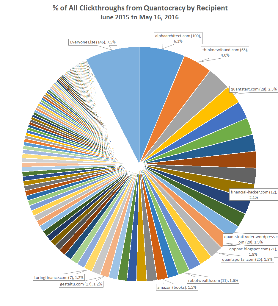
It’s been about a year since we launched Quantocracy. Over that time, we’ve sent about 450,000 clickthroughs to sites in the quant community, and that doesn’t even include RSS, Twitter, StockTwits and Facebook. To all of the denizens of Quantocracy: a big mahalo, gracias, 謝謝 and thank you for helping this community to grow.
But where are all those clicks going? I view this site as “ours” rather than “mine”, so I think a nerd data dump is in order. As we’ve shown previously, we’re rewarding quality by sending a lot more traffic to higher rated links. That’s good, but it’s only part of the story. The chart below shows the % of all clickthroughs, by recipient. I’ve highlighted a couple of important reference points, including the ten top ranked bloggers on the mashup.
Click graph to zoom. We drill down further into these numbers in the second graph at the bottom of the page.
Calculation notes: The number in parenthesis shows the number of links from that recipient. When we launched this site, we backfilled historical links from our old site, The Whole Street. Most of those links essentially never got clicked, so we required a link to be clicked at least 10 times to be included. Links on our blogroll (in the sidebar) were also included. Books in our library (as opposed to our mashup), as well as RSS and all of our social media feeds, were excluded.
Observations:
- We’re spreading the wealth across A LOT of sites. That’s good.
- As previously shown, higher rated links receive the most clickthroughs per link, but in terms of total clickthroughs, quantity often matters more. For example, the three highest rated bloggers on the mashup at the moment: Financial Hacker, Robot Wealth and Turing Finance, who also receive the most clicks per link, are fairly middling in terms of total clickthroughs, because they haven’t posted often.
- As a result, when a blog is both highly rated and posts often (ex. Alpha Architect and Flirting with Models aka “thinknewfound”), they receive an outsized portion of our total clickthroughs (Alpha Architect at 6%…wow).
- The numbers above only show Amazon clickthroughs from our mashup. 75% of clickthroughs to Amazon are from our book library or from the widget in the sidebar. That’s good, as I don’t want books to take up too much valuable real estate on the mashup itself.
- I don’t think that a blogger should conclude from this data simply that they should post more often. There’s real, tangible differences in the “quality” of clickthroughs. Without going into details, I can anecdotally say that a number of top ranked bloggers have found significant offline success as a result of the quality of their workmanship, despite posting infrequently. I think the inverse holds true as well.
And finally, this final chart shows all recipients of at least 0.1% of total clickthroughs (i.e. everything that got a slice of the pie chart above). Some sites may now be defunct. Click to zoom.

